Branding, Game Design
Capstone Project: ESCAPE
Class
Design Capstone
Software
Adobe Suite (Photoshop, Indesign, & Illustrator)
Escape is a brand that aims to mix the topical tabletop board game with an escape room. The brand is focused on bringing the adventure and puzzle solving from an escape room to your table at home.
Introducing Escape!


Solve the Puzzles, Steal the Art.
Prepare for the ultimate heist in the heart of the art world! In this thrilling escape room, you and your crew are expert thieves, tasked with stealing a priceless masterpiece from a high-security gallery. As you navigate the labyrinth of hidden passages, advanced security systems, and deceiving artwork, every move counts. Can you outsmart the guards, crack the codes, and make your daring escape with the treasure, or will the gallery’s secrets trap you forever? The clock is ticking—it's time to make your move!
Research
Industry Analysis
The first step in the research phase was to look at other brands of take home escape rooms to see their packaging and their game mechanics. Exit the Game is one of the more notable ones where they utilize a special decoder for each of their rooms. Another example would be Clue: Escape where they based it off of the popular board game, Clue and utilized tiles to lay our different parts of the room.
Breakout Escape Rooms
Going deeper, I decided to actually go behind the scenes at Breakout, an escape room company down in Virginia Beach. Something that I was interested in looking for is the community that is fostered inside of the rooms. Furthermore, what people tend to like about the escape rooms.

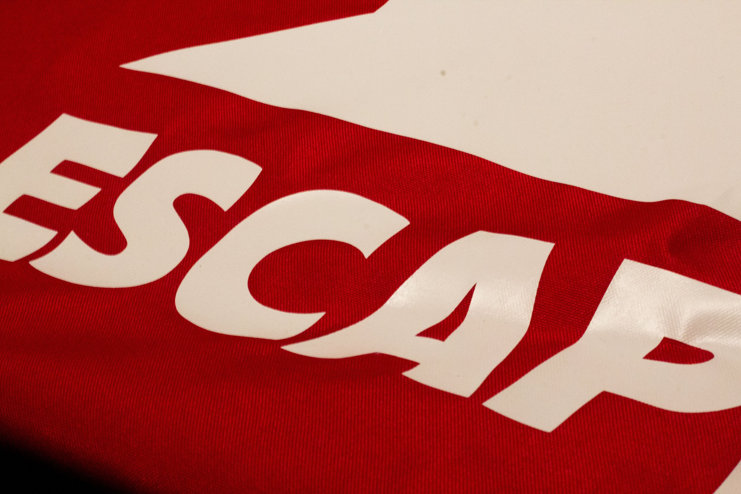
Escape’s Brand Idendity
Something that I wanted to focus on is the home aspect of the brand while also using iconic escape room iconography. As shown, in my sketches, to rough I moved away from the house and the key due to problems with scalability and then moved to the house and the lock idea for my final logo.
01.Logo

Logo Sketches

Logo Roughs
Final logo

02. Colors

03. Typography


Game Packaging
When designing the box, I wanted to focus on making sure that it sticks out in the aisle to the audience. Also, the photography used in the packaging was interesting and worked into the box. I first started out by using the photo of the games on the side but realized that I should not give everything away . I then decided to make the whole box red, and add brand icons and patterns to the box. Finally, I added photgoraphy to the packaging to make it feel finished and chohesive to everything else
01. Board Game Box
Packaging Roughs 1


Packaging Rough 2

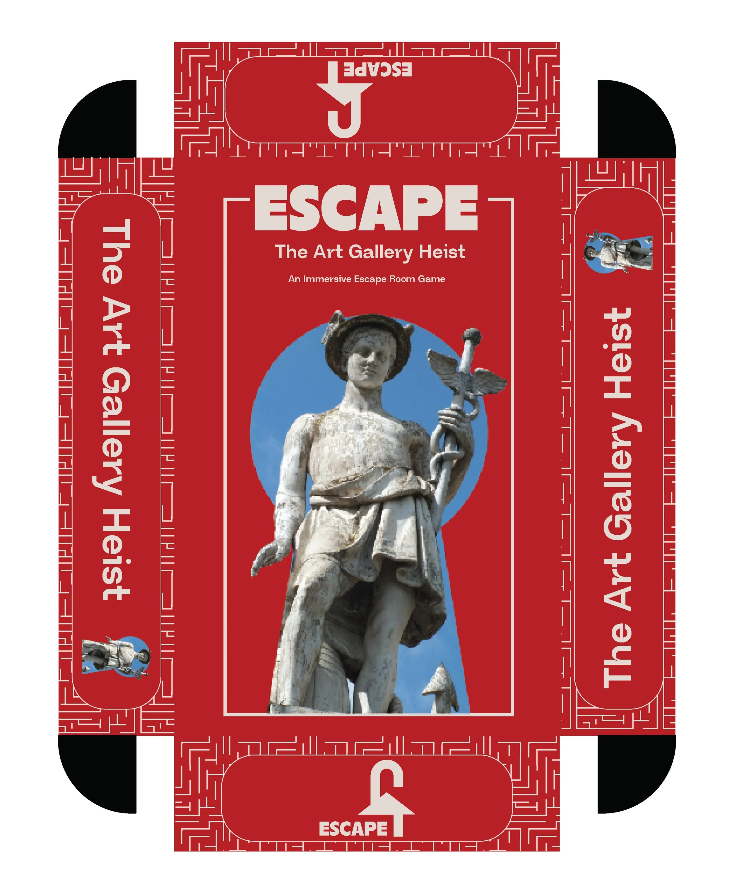
Final

Tabletop Game Assets
-
![]()
Gallery Poster
-
![]()
Room Board
-
![]()
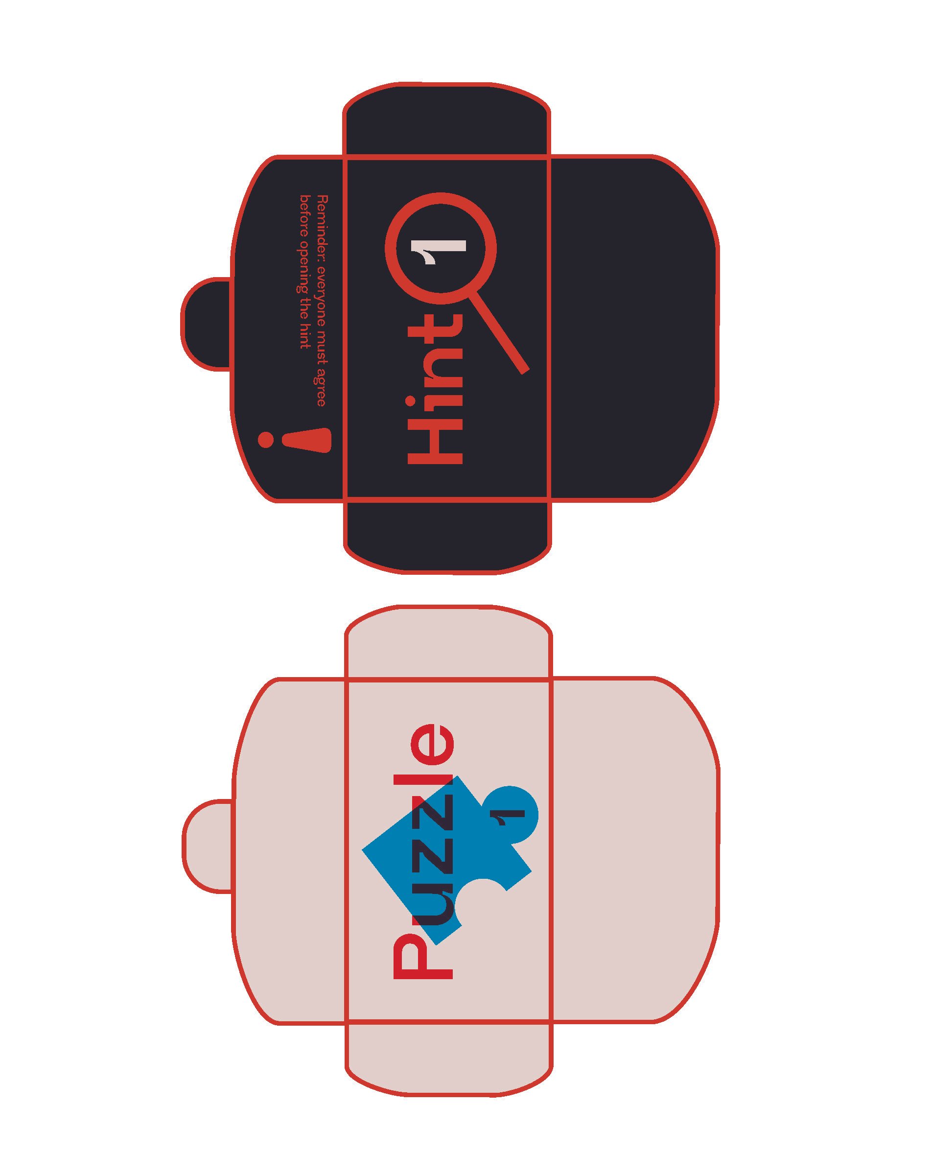
Puzzle and Hint Envelops
-
![]()
Gallery Itenerary
-
![]()
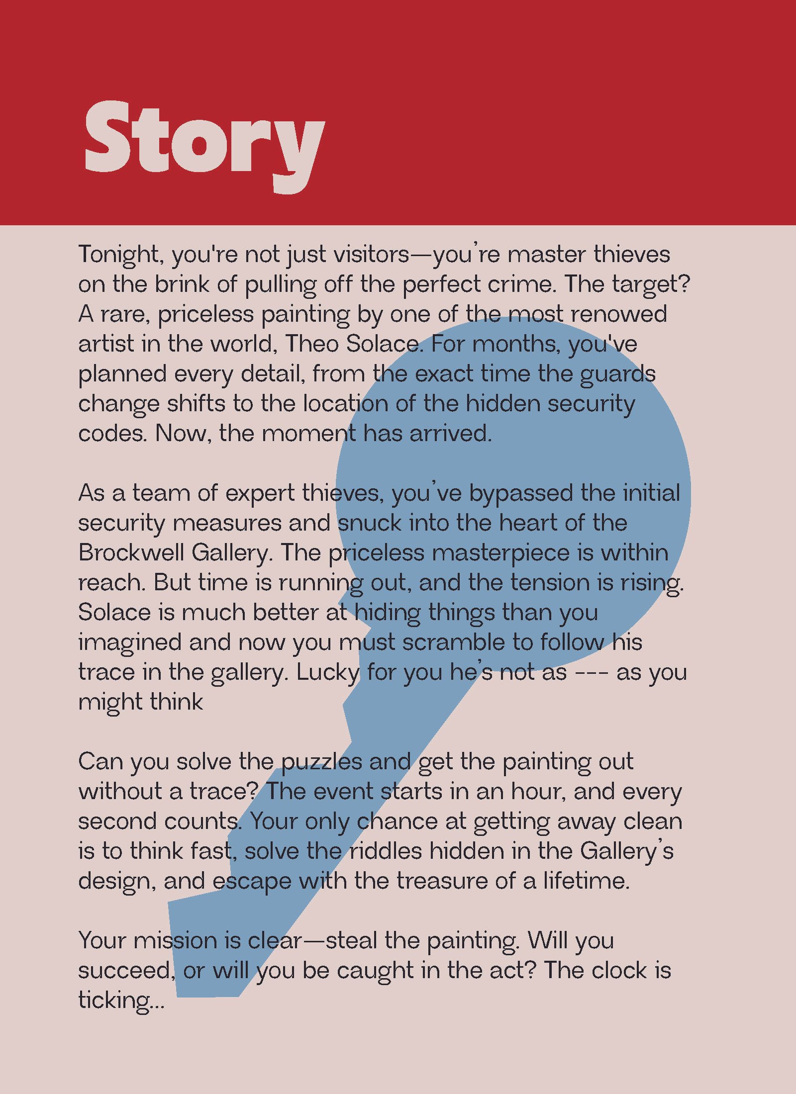
Story Card
-
![]()
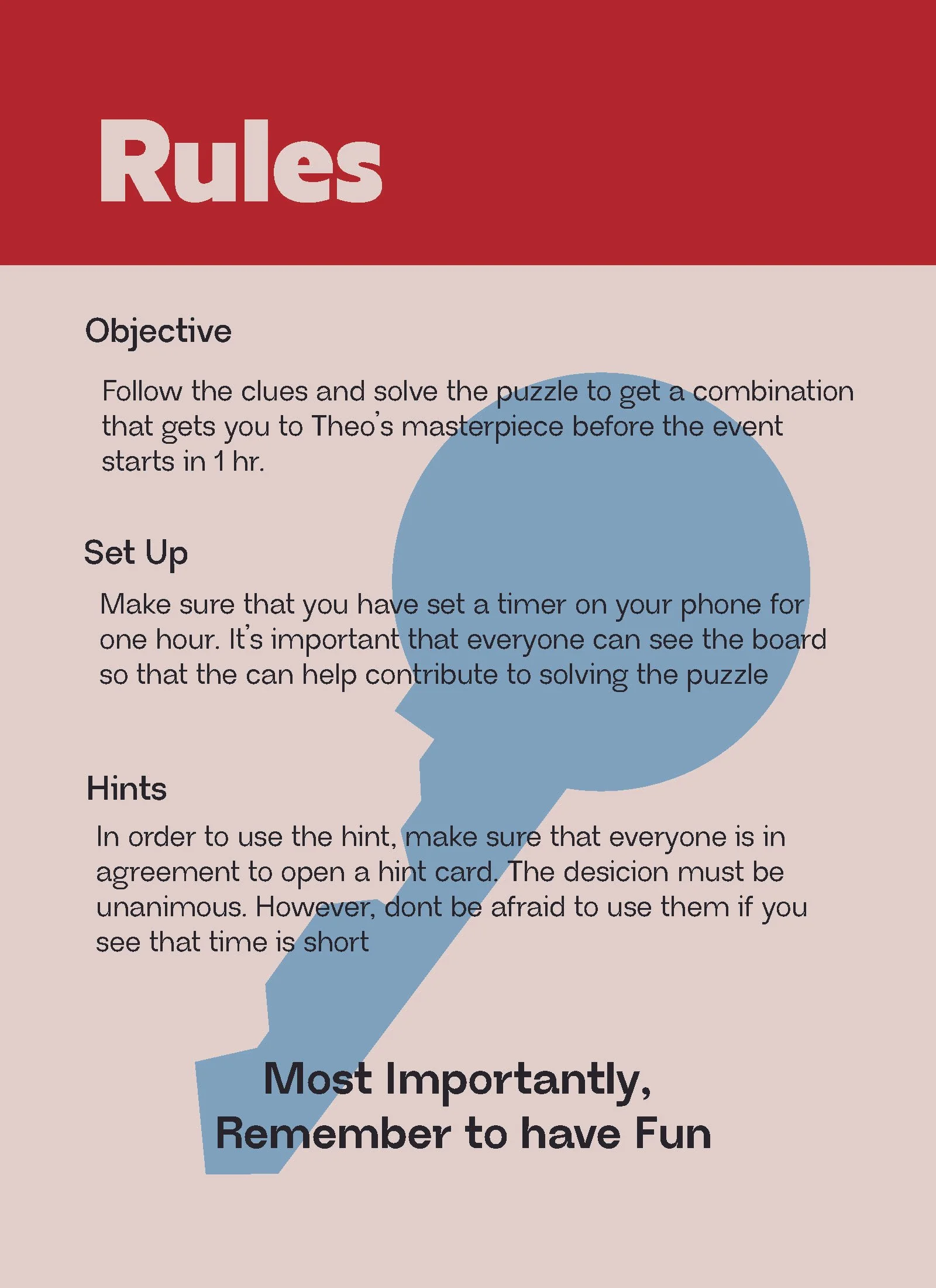
Rule Card


Takeaway
This project was presented at my graduating classes gala and the reception to it was positive. Something that I learned when working on Escape is how to present and create packaging for a board game. Furthermore I was able to improve upon how to create and present a visual identity of a brand. I also learned some tips when it came to conducting an industry research and what to look for and make sure to change in your brand to make it stand out.
