
UX/UI Design
Lit Scout: Bookstore App
Class
UX Design
Software
Figma
The class was given the task of creating an app based on a location that we thought could be more fun. A location that I have a personal attachment to is local bookstores. Introducing Litscout, an app that provides prompts and challenges that encourage the user to venture and explore local bookstores instead of bigger companies like amazon and Barns and Noble.
Project Overview
Research
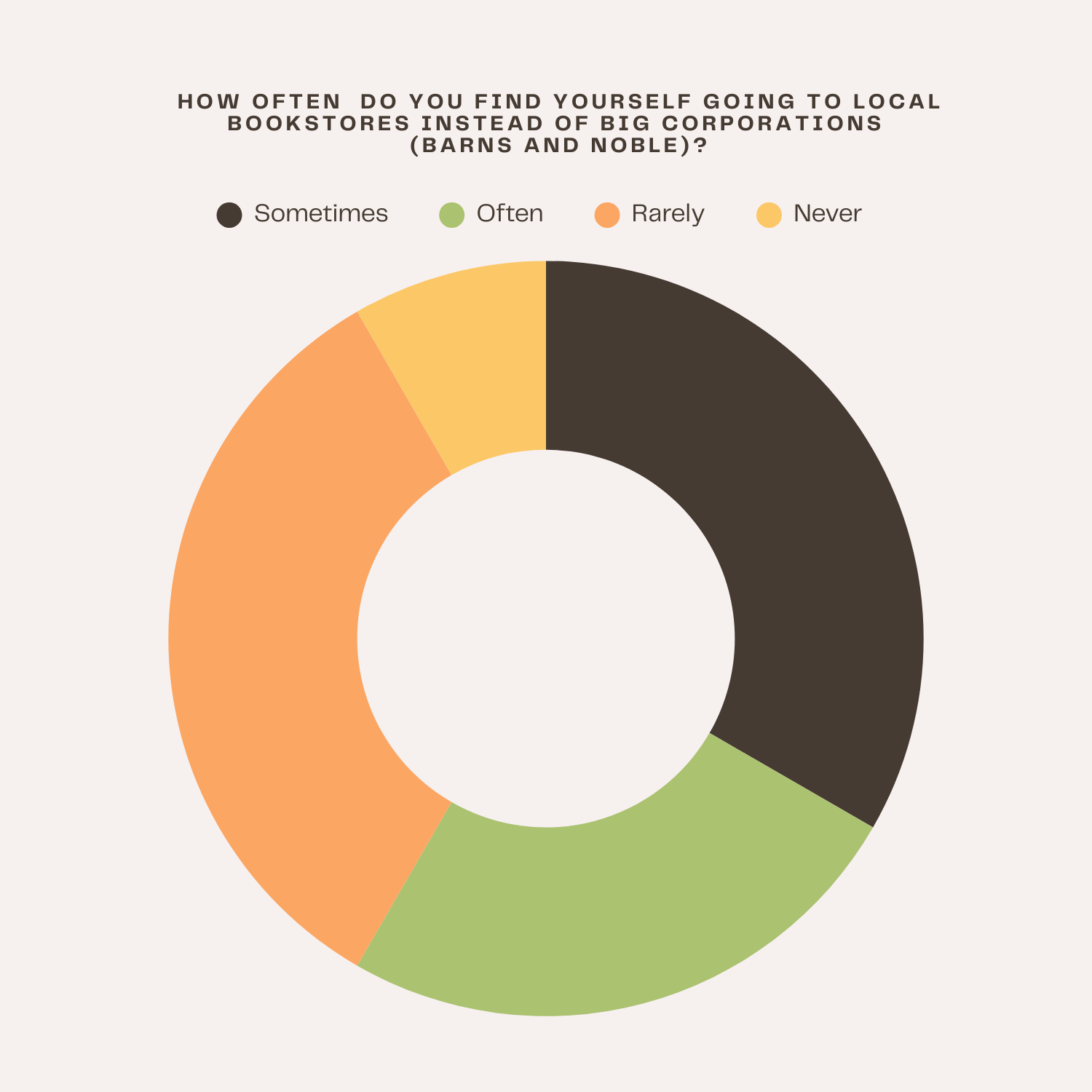
During my initial research, I found an article by the New York Times about why bookstores are now struggling. One of the reasons is that competitors like Amazon and Barnes and Noble are beating them out. I realized that my job through the app was to find a way to incentivize them to choose local bookstores instead of bigger companies
01. The Bookstore Problem
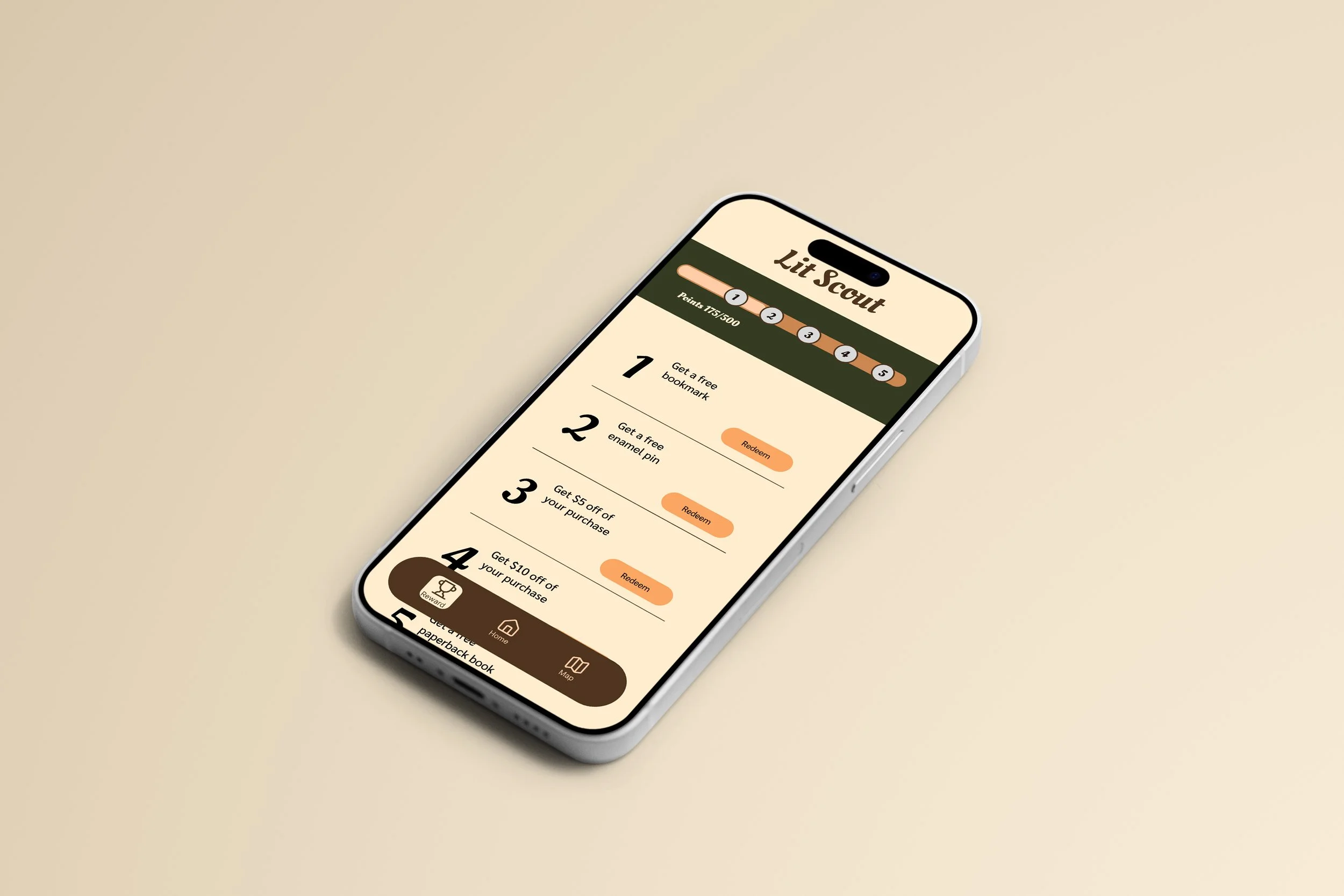
The main idea that I came up with is that different prompts would guide the user to find books at different local bookstores to complete these prompts. Furthermore, I would create a reward system to keep the user engaged with the app and push them to interact and by from the app.
02. Gamification and Exploration
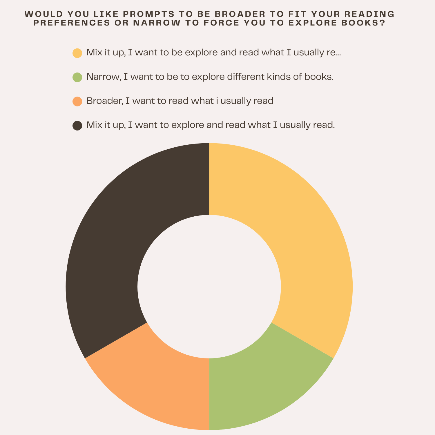
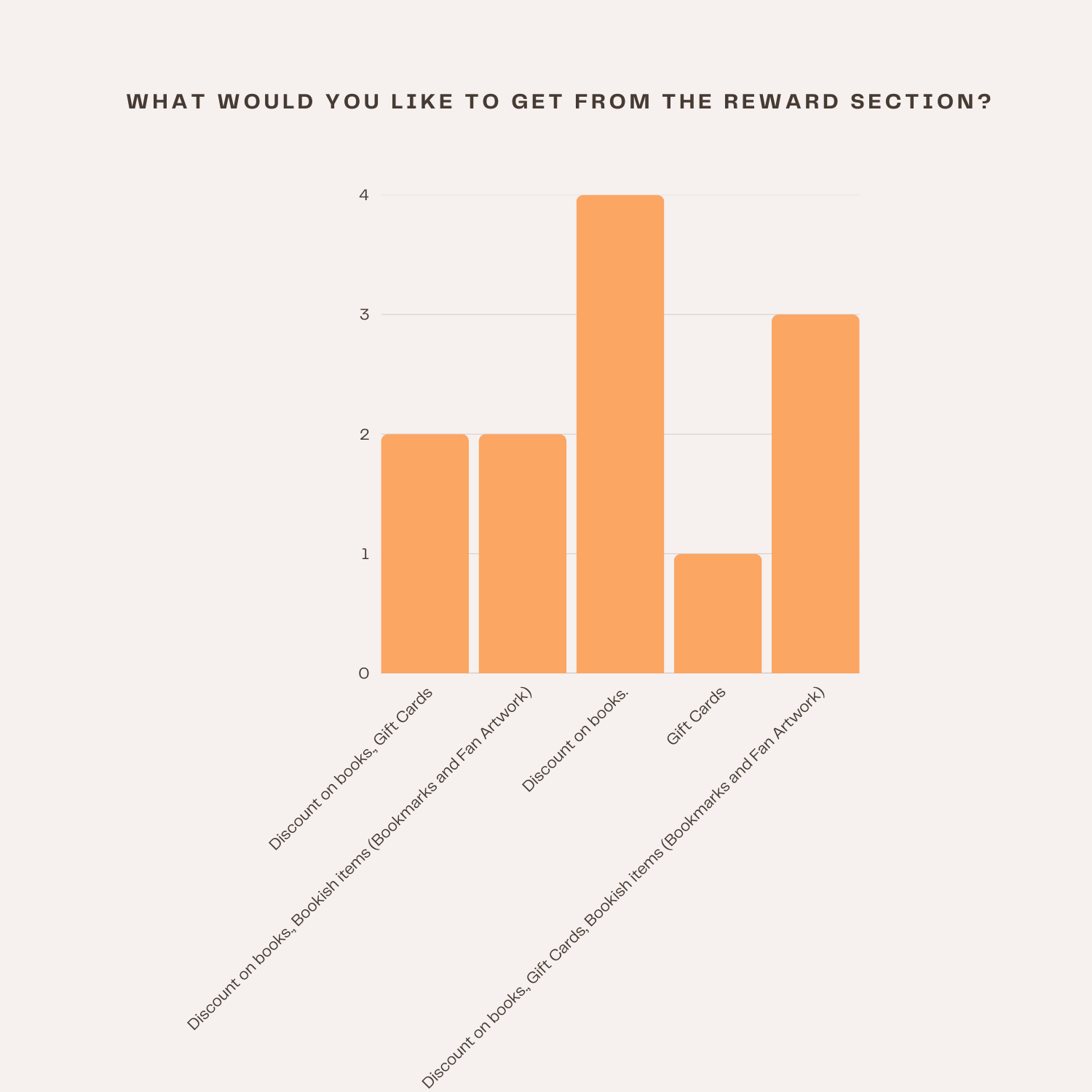
In order to get more information on the Users for my app, I created a survey form asking about their buying habits and what they would look for in an app about local bookstores.
03. Survey

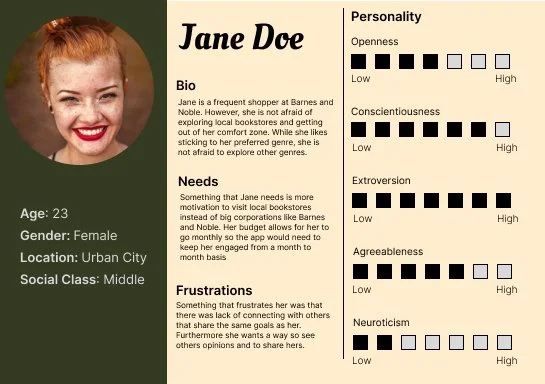
From the survey, I created two user personas for the app. The first one, Jane Doe, is my main demographic with high traits in exploration and is a highly social person. The second persona, Joe Doe, is targeted to people who are getting into exploring and maybe are looking for alternatives to major book sellers and moderatly social.
04. User Persona

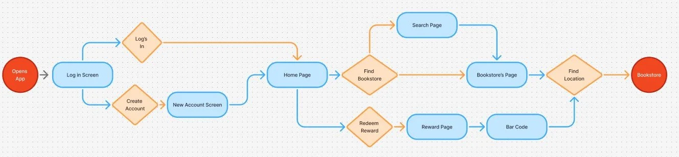
When creating the user flow, one of my main goals is to get the user into the bookstore by completing the prompts or just through their explorations. Furthermore, to incentivise them through the reward system to buy books and get into bookstores.
Creating Lit Scout
01. User Flow
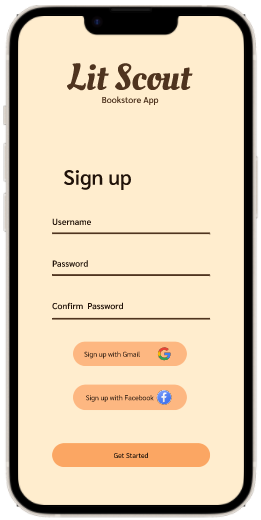
When adding the visuals, something that was important was giving the app more personality than you would usually see in a library app. I got this earthy color palette and Script font that seem to have some playfulness to it.
02. Identity
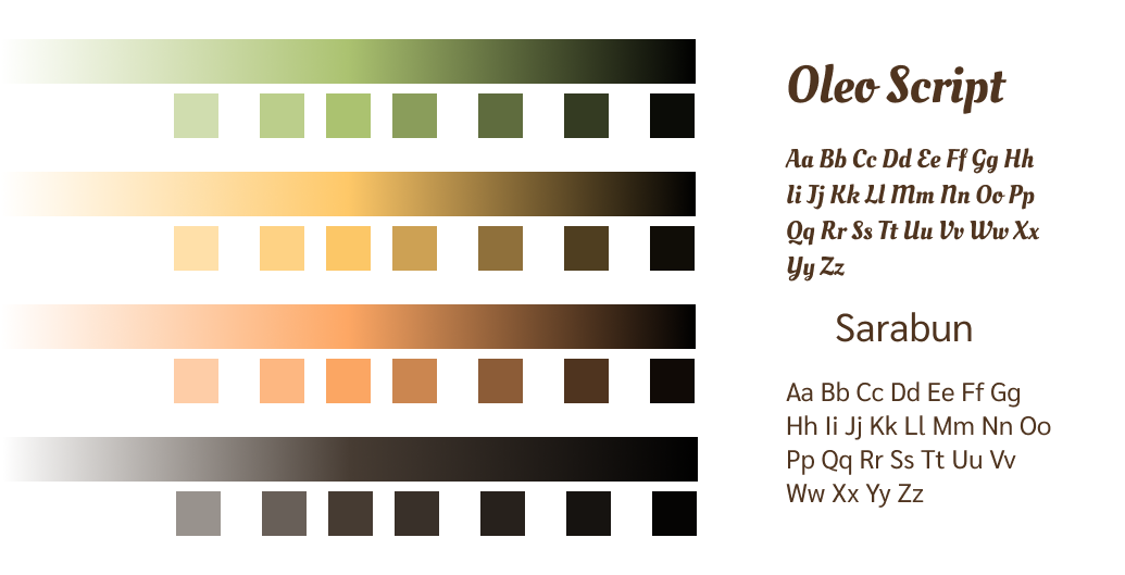
When adding the visuals, something that was important was giving the app more personality than you would usually see in a library app. I got this earthy color palette and Script font that seem to have some playfulness to it.
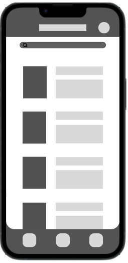
03. Wireframes


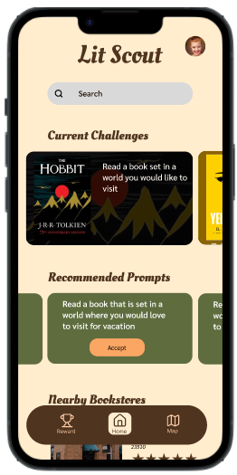
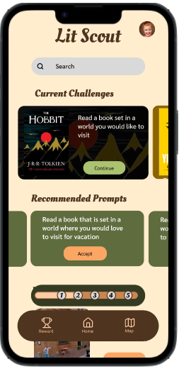
When adding the visuals, I found that my UI looked a bit outdated and lacked a clear vision. One of my main changes was the menu at the bottom of the screen. I decided to change to a pill shape because I thought it looked more modern and gave the UI more breathing room. Furthermore, some of the cards lost their backgrounds so that it wasn’t borders on top of boarders.
04. Adding Visuals


When Testing, I kept my goal of getting the user to the bookstore in mind and kept the rewards secondary. One thing that I tested was how quickly they made it to the direction screen. Another thing that I compared was the Homepage and the Map page. I wanted a reward card on the homepage to encourage the user to continue using the app. I found that the users liked the rewards on the page to be scrollable instead of fixed and that they were more likely to click on things faster without it in the way.
04. A/B Testing
Original Homepage
Two Variations of the Homepage

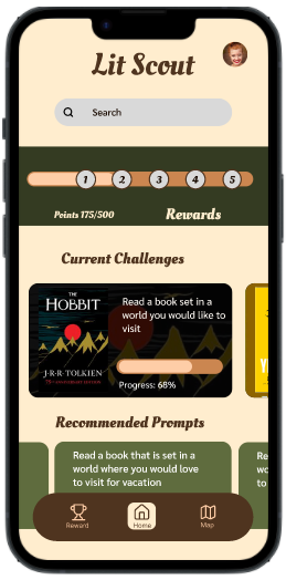
Final Homepage
Final Product
〰️
Final Product 〰️
During this project, I expanded upon my research methods to find what the user would like for my app. Some of the methods being user personas that help me visualize my target audience and different types of users that would interact with my app. Another method was creating a user flow to visualize how someone would navigate through my app to achieve the end goal of actually going to the bookstore and filling out the prompts.